Warm and Grounded Cosy Living Room Colors
 Save
Save There is a specific kind of quiet that only happens when the walls seem to hug you back. It is the feeling of sinking into a sofa after a long Tuesday while the evening shadows stretch across the floor. We will look at how to build that atmosphere using intentional palettes, soft lighting, and tactile layers.
The Magic of Warm Neutrals
White walls often feel clinical rather than calming. If you want a space that feels lived-in from day one, look toward shades like warm oatmeal or soft sand. These tones absorb light gently instead of bouncing it harshly around the room. A paint like Farrow & Ball’s ‘Shaded White’ provides that perfect, slightly creamy undertone that makes a corner feel sheltered.
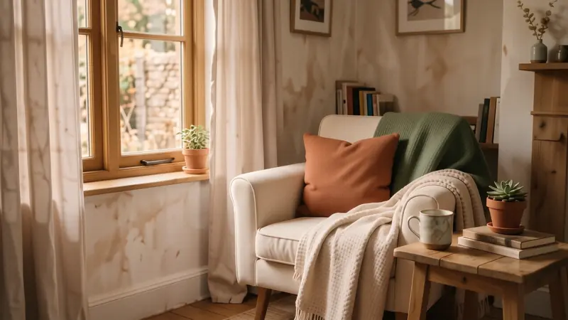
Neutrals provide a quiet backdrop for your life to unfold. You can layer different shades of the same color family to create depth without visual noise. Try pairing a heavy linen curtain in biscuit with a chunky knit throw in a pale ecru.
- Avoid stark, blue-based whites.
- Opt for undertones of yellow or pink.
- Use matte finishes to soften reflections.
Earthy Tones for Grounding
Deep colors can actually make a small room feel more intimate rather than smaller. Muted terracotta or a dusty sage green acts as an anchor for the eyes. These shades draw inspiration from the natural world, which helps lower our collective heart rate after a frantic day of screen time.
If you are renting and cannot paint the walls, use these colors through large-scale elements. A heavy velvet cushion in burnt sienna or a large jute rug can introduce these earthy pigments easily. It works well to ground a room that feels too airy or unmoored.
Think about how these colors interact with your furniture. A dark forest green accent wall looks stunning behind a mid-century teak sideboard.
The Role of Light Temperature
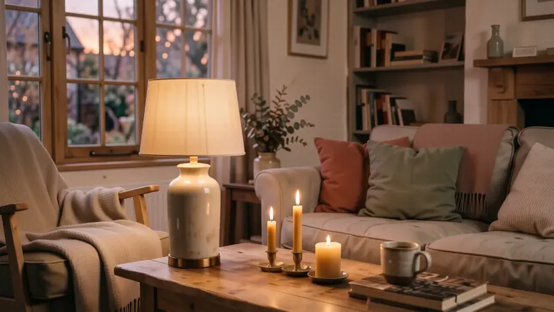
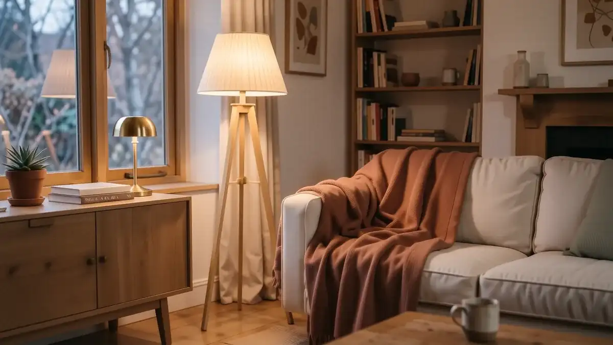
Color is nothing without the right light to reveal it. You might buy the most beautiful mushroom-colored paint, but if you use a cool 5000K LED bulb, that warmth will vanish instantly. For a true sense of hygge, stick to bulbs in the 2700K range.
This warmer temperature mimics the glow of sunset or candlelight. It pulls out the red and yellow undertones in your cosy living room colors. Instead of one bright overhead light, aim for three smaller sources at eye level.
Place a small brass lamp on a bookshelf or a floor lamp with a pleated fabric shade near your reading chair. This creates pockets of soft light that make the edges of the room recede into pleasant shadows.
Layering Textures and Materials
A monochromatic color scheme can feel flat if you don’t vary the tactile experience. To keep a beige or grey room from feeling boring, you must introduce weight through different fabrics. Think of texture as the physical manifestation of your color palette.
A smooth silk pillow provides a sharp contrast to a heavy, oversized wool rug. You might mix a rough terracotta clay vase with a soft, tumbled linen tablecloth for a sensory experience that feels intentional and rich.
- Boucle for softness.
- Jute or sisal for grit.
- Velvet for depth.
Small Space Solutions
Living in a tiny apartment or a cozy uni room doesn’t mean you have to sacrifice atmosphere. When floor space is limited, focus on the vertical planes. Use peel-and-stick wallpaper in a subtle botanical print or a soft clay hue to add character without permanent changes.
In smaller quarters, light colors can help prevent a claustrophobic feeling. However, adding one dark, moody element—like a navy blue velvet beanbag or a deep charcoal rug—can give the room a sense of purpose and weight. It prevents the space from looking like it is floating in an endless white void.
Small changes yield big results. A single well-placed lamp can transform a cramped corner into a sanctuary.
Creating a Zen Corner
Sometimes we need a specific area dedicated entirely to stillness. A cozy zen room approach involves stripping away the clutter and focusing on a very tight color story. Stick to three colors maximum: perhaps a soft stone, a light wood tone, and a single accent of moss green.
Keep your surfaces mostly clear. Instead of a mountain of books, choose one beautiful hardback and a small stone bowl for your keys. This visual breathing room allows the mind to settle more quickly when you sit down.
Use low-profile furniture to keep the sightlines open. A floor cushion in a heavy woven cotton can serve as an inviting spot for meditation or morning coffee.
The Impact of Natural Elements
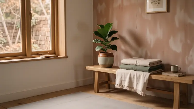
Bringing the outdoors in is an easy way to bridge the gap between your interior colors and the natural world. Wood, stone, and greenery act as neutral anchors that work with almost any palette. A reclaimed oak coffee table brings a sense of history and warmth that plastic or metal simply cannot replicate.
Plants add a living dimension to your cosy living room colors. The deep green of a Monstera leaf looks spectacular against a backdrop of muted terracotta or warm cream. It adds movement and life to a static arrangement of furniture.
Avoid overly shiny plastics. Instead, look for matte ceramics or brushed metals that feel more organic under your touch.
The Scent of Comfort
While not strictly a color, the sensory environment is completed by what we smell. A room that looks warm but smells like harsh lemon cleaner will never feel truly cozy. To complement your earthy tones, choose scents that feel grounded.
Cedarwood, sandalwood, or amber notes pair beautifully with deep browns and oranges. If you have chosen a lighter, more airy palette of oatmeal and sage, consider something fresher like bergamot or dried lavender. This creates a cohesive atmosphere where the eyes and nose are in agreement.
Use soy wax candles or essential oil diffusers to keep the scent subtle rather than overpowering.
Evolving with the Seasons
Your home does not need to stay frozen in one state. You can shift your color story as the light changes throughout the year. In winter, lean into those heavier textures and darker, more cocoon-like shades.
When spring arrives, swap out the heavy wool throws for lighter linen versions in pale peach or sky blue. This keeps the space feeling fresh without requiring a total overhaul of your furniture. Small adjustments to your textiles allow your room to breathe alongside you through the passing months.
Frequently asked questions
How can I make a grey room feel less cold?
Introduce warmth through texture and light. Add amber-toned lighting (2700K) and use materials like wood, wool, or cognac leather to offset the coolness of the grey.
What are the best colors for a small living room?
Light neutrals like warm oatmeal or soft sand help expand the space. You can also use deep colors on just one wall to add depth without making it feel cramped.
Is dark paint too risky for renters?
Not if you use accents. Instead of painting walls, try large rugs, velvet pillows, or even peel-and-stick wallpaper in moody tones like forest green or navy.
How do I choose between matte and gloss paint?
Matte is generally better for a cozy feel because it absorbs light and hides wall imperfections. Gloss can feel quite energetic and reflective, which might disrupt a calm atmosphere.
More ideas → Cozy Living Room Ideas
Keep reading
Warmth and Glow: Cozy Lighting Living Room Ideas
Discover practical cozy lighting living room ideas to transform your space with warm tones, layered textures, and easy renter-friendly upgrades.
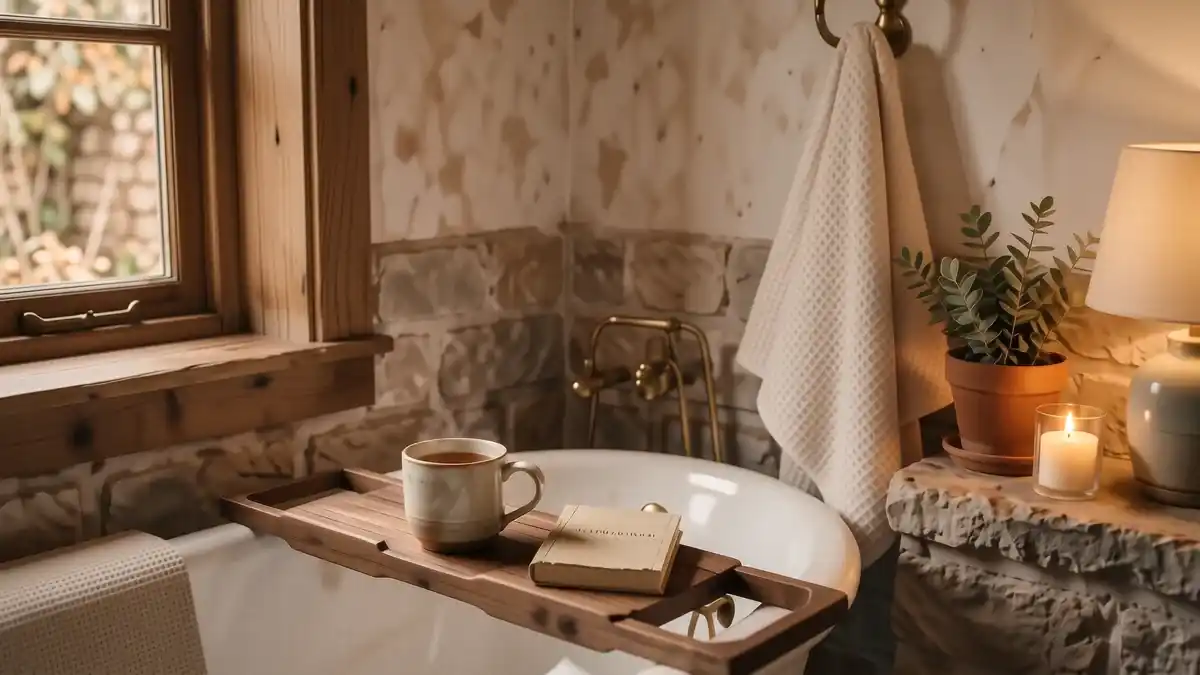
Simple Cosy Bathroom Ideas for a Warm Retreat
Cosy bathroom ideas that actually work. From warm lighting to soft textures, learn how to create a relaxing sanctuary this weekend.
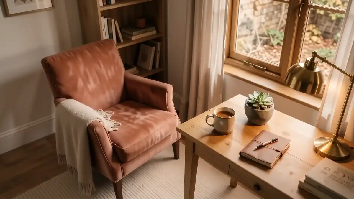
How to Choose a Cosy Home Office Chair
Simple cosy home office chair that shift the whole mood. Discover specific textures, lighting tips, and renter-friendly styling ideas for comfort.
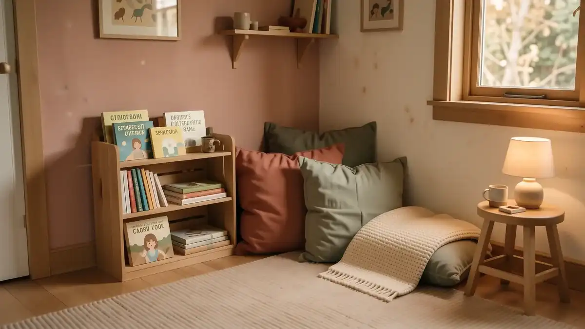
How to Build a Cosy Reading Nook for Kids
Create a magical cosy reading nook kids will love with these simple, renter-friendly ideas involving soft textures, warm light, and clever storage.